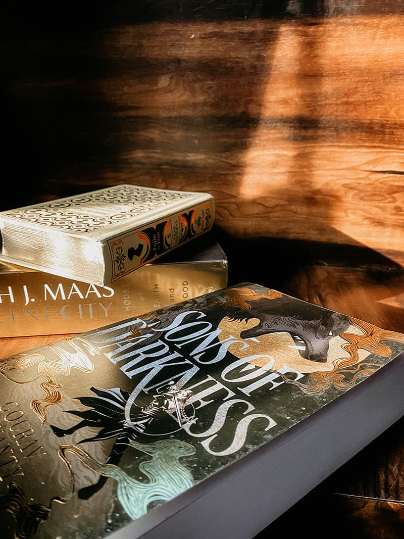
Unravelling The Art Of Book Cover Design For His Title Sons Of Darkness
I still remember receiving the proof copy a few months ago. Those days, I had been like Narcissus, staring at my cover without end and who can blame me? Sons of Darkness has a freaking beautiful cover.
I’ve received a lot of questions about the cover process over the past few months – how did I go about it? How much input do I get? Do I choose the artist? What if I hate the cover? Can I choose the font?–and I thought it might be fun to walk you all through the creation of Sons of Darkness’ cover art.
A cover is a window to the book’s soul. The norm is that the publisher puts together a cover memo for the art team but solicits the author’s input before he sends it in. This includes information like the mood board, core target audience, the tone, and comparisons to similar books in the market. Sons of Darkness is the first epic fantasy (grimdark that too) that hits the middle of the Venn diagram between Game of Thrones and Mahabharata, so we were aiming not just for readers who enjoy mythological fiction, but also for readers who like political intrigue and high pitched sword battles.
That is why, in a perfectionist fit, I wanted to be the one to choose my book cover designer. And after a lot of research, I came to surrender my heart to my-to-be Michelangelo- Micaela Alcaino. When I clicked open Micaela’s IG portfolio, my jaw dropped. She is a wonderfully talented coversmith from the UK who recently won the Designer of the Year in the British Book Awards 2022. Here are a few of my favourite pieces she’s done:
The Fates were smiling on me for Micaela had entered freelancing. I reached out to her way in advance around May 2021 when my book was slated to release around May 2022, and that had been a good call for I was able to secure a spot in her justifiably overbusy calendar only in August 2021. I presumed the real challenge would be to convince my publishers to be on board with the idea and her quote. Craftily, I sent across first the pictures of the work Micaela had done, and then made my pitch. They were floored, and the game was afoot.
So, how does the process unravel?
Briefing Form:
At the outset, Micaela sent me a briefing form that felt like a chat show with KJO for the number of detailed questions she’d asked. And this was a sign that my cover was in good hands for it was just not a commission for Micaela to be done and dusted with. She deep-dived into the themes, the plot movers, the characters and the synopsis of the book before she created a mood board.
Moodboard:
A mood board is an arrangement of images intended to project a particular style or concept. See this mood board from the memo: all books which I’ve read and loved, and all books whose readers would probably enjoy Sons of Darkness as well
Brainstorming:
First Sketch: We agreed early on that Sons of Darkness would have a black base. It’ll be a proper brick of a book, and we wanted it to really pop on bookshelves. We needed something dark, foreboding, and mysterious. Something that promised great and terrible things within.
Still, Sons of Darkness needed something different; some new element to emphasize its unique intersection of dark political intrigue, war, Vedic history, and epic fantasy. For it is just not another mythic retelling; it is a reimagining that is rooted firmly in the grey shades that do not bother itself with the good-bad dichotomy.
So, Micaela used the Wolf as the main motif (symbolic of a squad of female soldiers in the book called Silver Wolves) and played around with a few covers. Four of my favourites out of the options she had come up with are set out below:
Main Choice:
I ultimately went for the bottom left option (with a tweak of substituting the male archer with a female swordswoman). I was psyched by the cover for the following reasons:
- Eclipse- I wanted a symbolism for the darkness that is ‘active’ rather than just a latent black background and thought Eclipse was the perfect candidate. The fact that it also plays a clever pun on the word Sons (Suns) of Darkness quenched my Pratchett/Wodehouse leanings.
- Warrior-The other suggestion I had was of putting the character of Satyabhama, a war chief and the third wife to a senator in the book, on the cover. This was to create a gender balance with the word ‘Sons’ in the title because women really are the story movers in the book.
- Asymmetry: What I love most about the cover however is how it throws symmetry to the wind. No centrally positioned object or mirrored themes. The cover had that kind of good tension where everything is not predictable, and the whacky angle of the wolf cross-positioned with Satyabhama made it dazzling.
Micaela then waved her wand.
And Presto!
Related: For Game Of Thrones Fans, Here Is A Grim Dark Fantasy That Will Lead You Through The Political Labyrinthine Of Folklore In A New Avatar | Book Review Of Sons Of Darkness By Gourav Mohanty
So, hope you guys liked this article by Gourav Mohanty, elaborating upon the steps to designing and illustrating a beautiful cover. Let us know in the comments below which other titles you would like us to read and review. Let us know in the comments below which other titles you would like us to read and review. Booxoul, India’s leading lifestyle and review blog are always committed to getting you the best in the field of entertainment, lifestyle, travel, food, tech and gadgets, finance, as well as all things bookish. Stay tuned for exciting stuff coming real soon!!
Adios Amigos!
An internationally accredited book blogger, voracious reader and the founder of Booxoul, one of India’s leading book and lifestyle blogs, Neelam is a person with a penchant for bringing out the best in people. A website designer, a renowned book blogger and a leading creative influencer on Instagram, here is a lady who is candid, closer to life and sensitive to the softest of emotions…
A Book Blogger, Reviewer, a true friend, honest critique, a relentless benefactor and more…


